How to Draw Regression Lines in SPSS?
- Method A – Legacy Dialogs
- Method B – Chart Builder
- Method C – CURVEFIT
- Method D – Regression Variable Plots
- Method E – All Scatterplots Tool
Summary & Example Data
This tutorial walks you through different options for drawing (non)linear regression lines for either all cases or subgroups. All examples use bank-clean.sav, partly shown below.

Method A – Legacy Dialogs
A simple option for drawing linear regression lines is found under

as illustrated by the screenshots below.
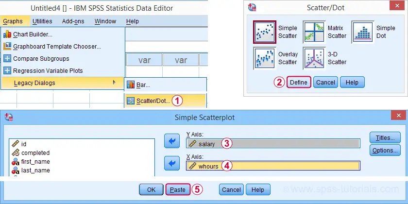
Completing these steps results in the SPSS syntax below. Running it creates a scatterplot to which we can easily add our regression line in the next step.
GRAPH
/SCATTERPLOT(BIVAR)=whours WITH salary
/MISSING=LISTWISE.
For adding a regression line, first double click the chart to open it in a Chart Editor window. Next, click the “Add Fit Line at Total” icon as shown below.
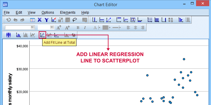
You can now simply close the fit line dialog and Chart Editor.
Result
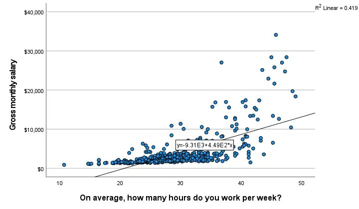
The linear regression equation is shown in the label on our line:
y = 9.31E3 + 4.49E2*x
which means that
$$Salary’ = 9,310 + 449 \cdot Hours$$
Note that 9.31E3 is scientific notation for 9.31 · 103 = 9,310 (with some rounding).
You can verify this result and obtain more detailed output by running a simple linear regression from the syntax below.
regression
/dependent salary
/method enter whours.
When doing so, you’ll also have significance levels and/or confidence intervals. Finally, note that a linear relation seems a very poor fit for these variables. So let’s explore some more interesting options.
Method B – Chart Builder
For SPSS versions 25 and higher, you can obtain scatterplots with fit lines from the chart builder. Let’s do so for job type groups separately: simply navigate to
and fill out the dialogs as shown below.
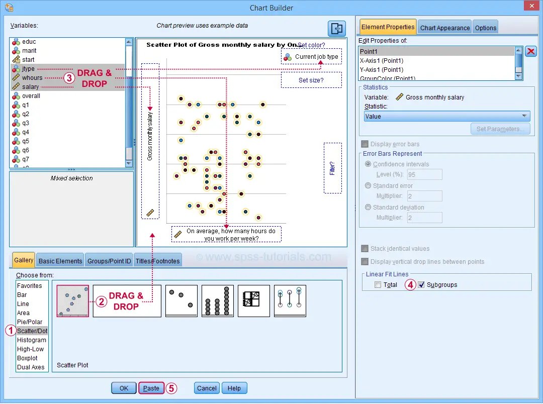
This results in the syntax below. Let’s run it.
GGRAPH
/GRAPHDATASET NAME=”graphdataset” VARIABLES=whours salary jtype MISSING=LISTWISE REPORTMISSING=NO
/GRAPHSPEC SOURCE=INLINE
/FITLINE TOTAL=NO SUBGROUP=YES.
BEGIN GPL
SOURCE: s=userSource(id(“graphdataset”))
DATA: whours=col(source(s), name(“whours”))
DATA: salary=col(source(s), name(“salary”))
DATA: jtype=col(source(s), name(“jtype”), unit.category())
GUIDE: axis(dim(1), label(“On average, how many hours do you work per week?”))
GUIDE: axis(dim(2), label(“Gross monthly salary”))
GUIDE: legend(aesthetic(aesthetic.color.interior), label(“Current job type”))
GUIDE: text.title(label(“Scatter Plot of Gross monthly salary by On average, how many hours do “,
“you work per week? by Current job type”))
SCALE: cat(aesthetic(aesthetic.color.interior), include(
“1”, “2”, “3”, “4”, “5”))
ELEMENT: point(position(whours*salary), color.interior(jtype))
END GPL.
Result
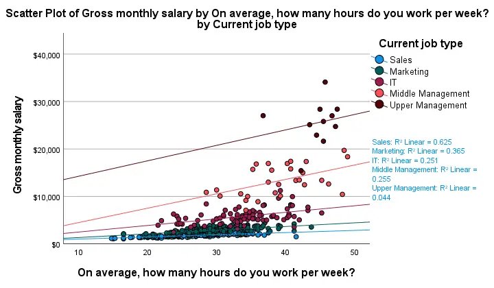
First off, this chart is mostly used for
- inspecting homogeneity of regression slopes in ANCOVA and
- simple slopes analysis in moderation regression.
Sadly, the styling for this chart is awful but we could have fixed this with a chart template if we hadn’t been so damn lazy.
Anyway, note that R-square -a common effect size measure for regression- is between good and excellent for all groups except upper management. This handful of cases may be the main reason for the curvilinearity we see if we ignore the existence of subgroups.
Running the syntax below verifies the results shown in this plot and results in more detailed output.
sort cases by jtype.
split file layered by jtype.
*SIMPLE LINEAR REGRESSION.
regression
/dependent salary
/method enter whours.
*END SPLIT FILE.
split file off.
Method C – CURVEFIT
Scatterplots with (non)linear fit lines and basic regression tables are very easily obtained from CURVEFIT. Jus navigate to
and fill out the dialog as shown below.
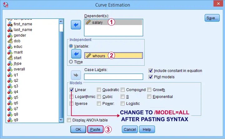
If you’d like to see all models, change /MODEL=LINEAR to /MODEL=ALL after pasting the syntax.
TSET NEWVAR=NONE.
CURVEFIT
/VARIABLES=salary WITH whours
/CONSTANT
/MODEL=ALL /* CHANGE THIS LINE MANUALLY */
/PLOT FIT.
Result
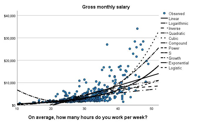
Despite the poor styling of this chart, most curves seem to fit these data better than a linear relation. This can somewhat be verified from the basic regression table shown below.
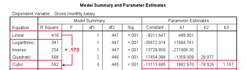
Especially the cubic model seems to fit nicely. Its equation is
$$Salary’ = -13114 + 1883 \cdot hours – 80 \cdot hours^2 + 1.17 \cdot hours^3$$
Sadly, this output is rather limited: do all predictors in the cubic model seriously contribute to r-squared? The syntax below results in more detailed output and verifies our initial results.
compute whours2 = whours**2.
compute whours3 = whours**3.
regression
/dependent salary
/method forward whours whours2 whours3.
Method D – Regression Variable Plots
Regression Variable Plots is an SPSS extension that’s mostly useful for
- creating several scatterplots and/or fit lines in one go;
- plotting nonlinear fit lines for separate groups;
- adding elements to and customizing these charts.
I believe this extension is preinstalled with SPSS version 26 onwards. If not, it’s supposedly available from STATS_REGRESS_PLOT but I used to have some trouble installing it on older SPSS versions.
Anyway: if installed, navigating to
should open the dialog shown below.
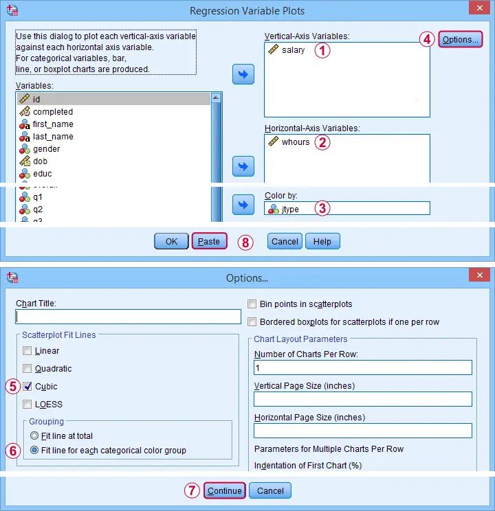
Completing these steps results in the syntax below. Let’s run it.
STATS REGRESS PLOT YVARS=salary XVARS=whours COLOR=jtype
/OPTIONS CATEGORICAL=BARS GROUP=1 INDENT=15 YSCALE=75
/FITLINES CUBIC APPLYTO=GROUP.
Result
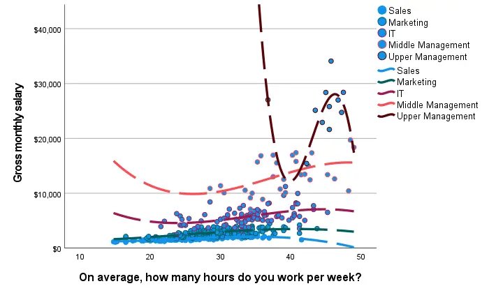
Most groups don’t show strong deviations from linearity. The main exception is upper management which shows a rather bizarre curve.
However, keep in mind that these are only a handful of observations; the curve is the result of overfitting. It (probably) won’t replicate in other samples and can’t be taken seriously.
Method E – All Scatterplots Tool
Most methods we discussed so far are pretty good for creating a single scatterplot with a fit line. However, we often want to check several such plots for things like outliers, homoscedasticity and linearity. This is especially relevant for
- multiple regression analysis and
- correlation analysis.
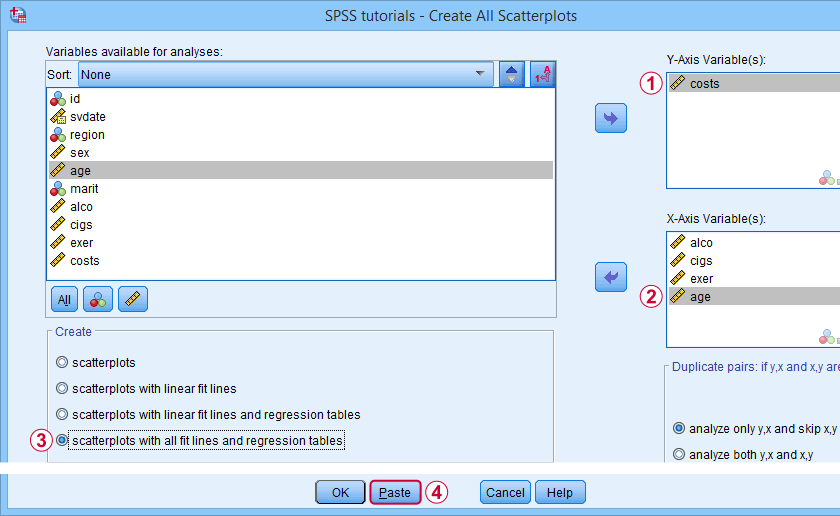
A very simple tool for precisely these purposes is downloadable from and discussed in SPSS – Create All Scatterplots Tool.
Final Notes
Right, so those are the main options for obtaining scatterplots with fit lines in SPSS. I hope you enjoyed this quick tutorial as much as I have.
If you’ve any remarks, please throw me a comment below. And last but not least:
thanks for reading!